[PT-BR]
Sobre
KOE Poke nasceu da vontade de trazer o frescor e a praticidade de comer um poke de forma descomplicada, fazendo com que os ingredientes selecionados a dedo pelo chef e fundador cheguem com a maior qualidade possível na porta de sua casa sem preocupação, convidando as pessoas a saborearem os sabores únicos dentro do clima tropical de Manaus.
Com um restaurante online, o KOE Poke busca sempre trazer uma alta qualidade e uma experiência acolhedora para seus clientes, com um atendimento 100% humano, brindes nos pedidos e uma comunicação leve e bem gentil, a marca está sempre disposta a entregar não apenas uma comida, mas uma verdadeira relação com seus consumidores.
[EN]
About
KOE Poke was born from the desire to bring the freshness and convenience of eating a poke bowl in a simple way, ensuring that the ingredients, hand-picked by the chef and founder, arrive at your door with the highest possible quality and without any hassle. It's an invitation for people to savor unique flavors within the tropical atmosphere of Manaus.
As an online restaurant, KOE Poke always seeks to provide high quality and a welcoming experience for its customers. With 100% human service, special gifts with orders, and lighthearted, friendly communication, the brand is always committed to delivering not just a meal, but a true relationship with its customers.
[PT-BR]
Conceito
A identidade visual do KOE Poke parte do conceito de trazer de forma não tão obvia elementos da cultura japonesa, enquanto ainda preserva essa proximidade, modernidade e acolhimento que estão muito presentes em seus valores, sem deixar de lado a inspiração que deu origem ao nome da marca, o peixe Koi.
[EN]
Concept
The visual identity of KOE Poke is based on the concept of subtly incorporating elements of Japanese culture, while still preserving the sense of closeness, modernity, and warmth that are central to its values. This is all done without losing the inspiration behind the brand's name, the Koi fish.
[PT-BR]
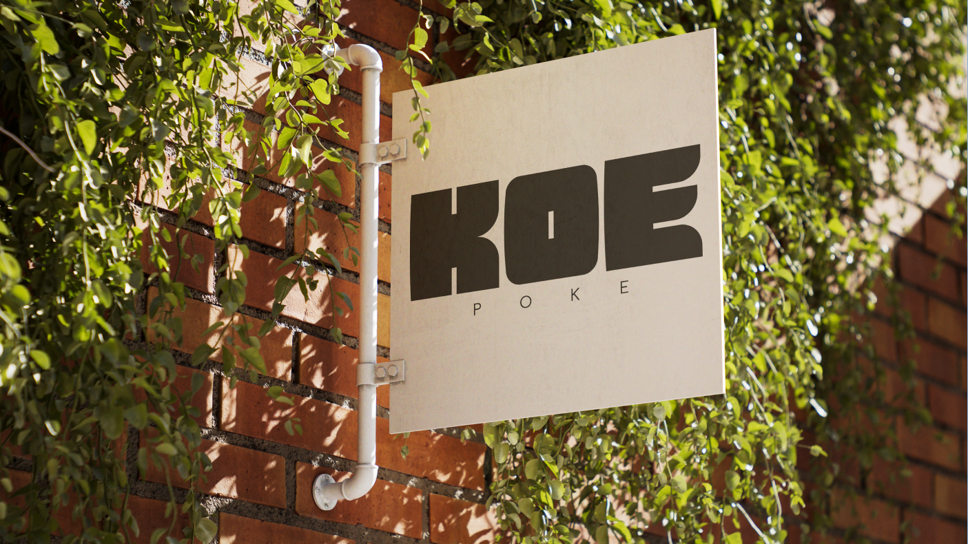
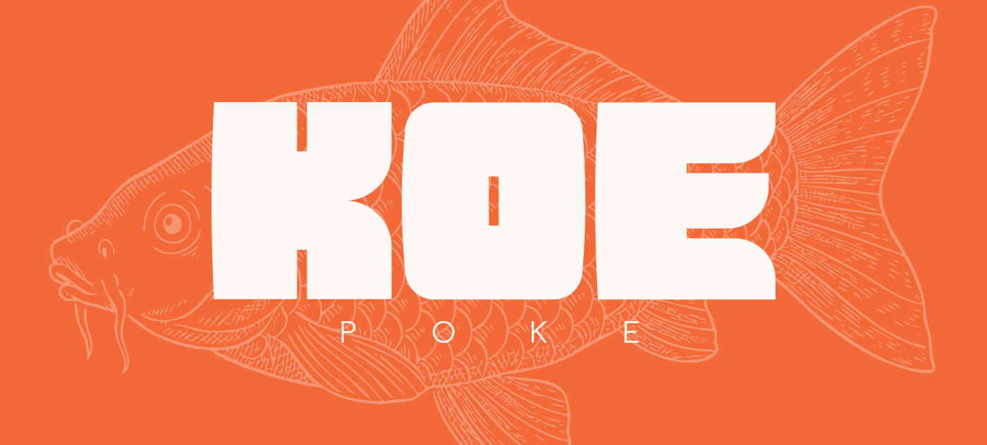
Logo
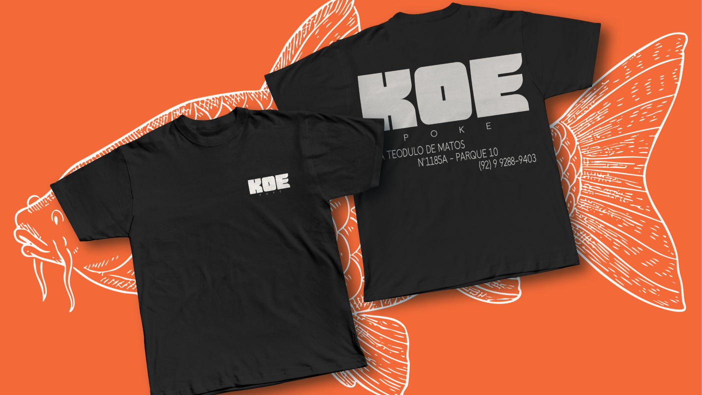
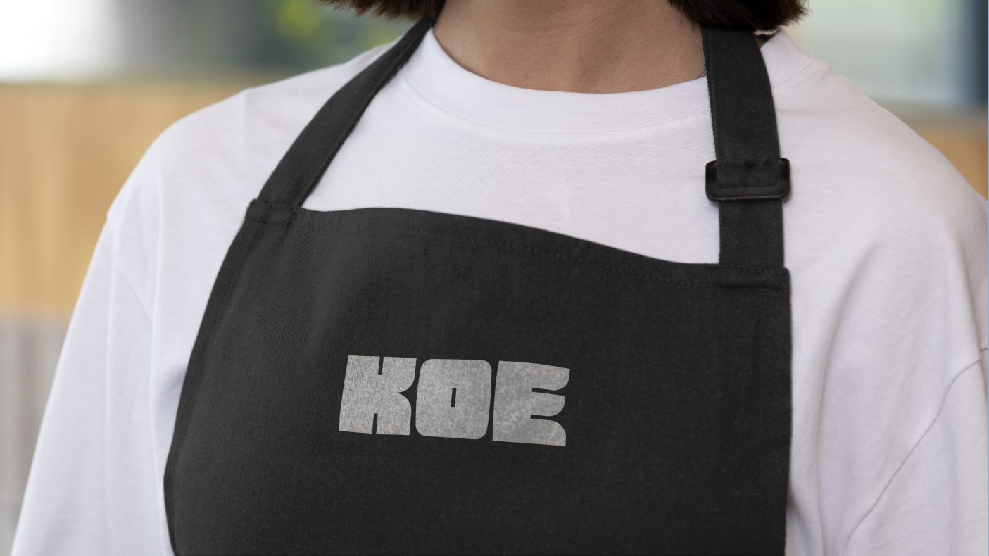
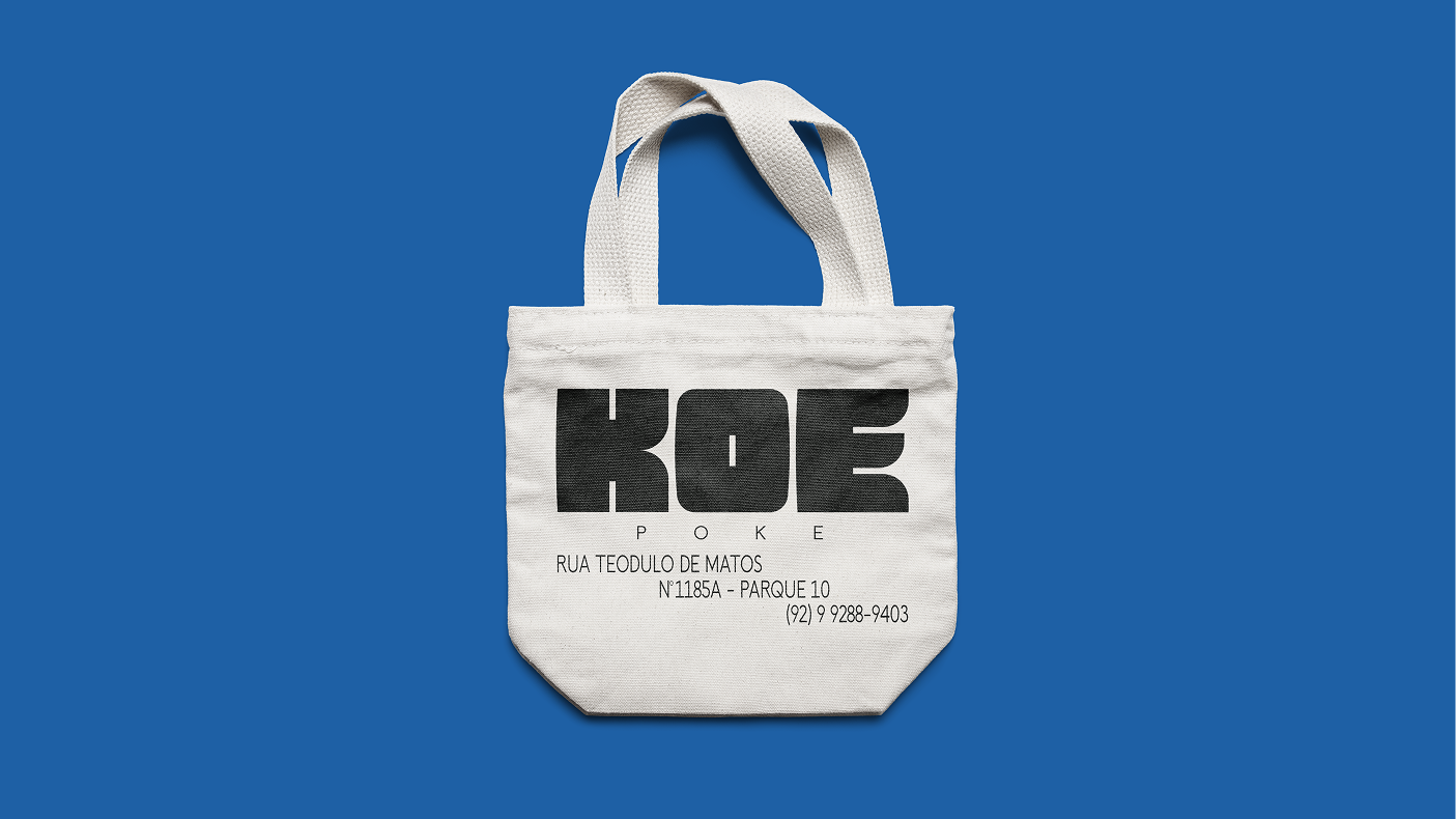
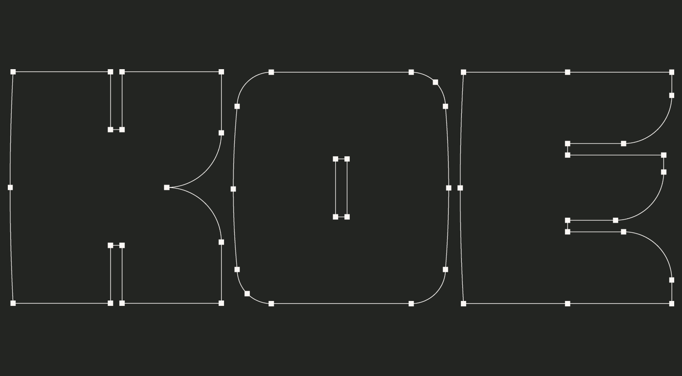
A marca transmite uma aproximação com uma leve referência a tipografias japonesas baseadas nas ruas de Tóquio. Suas formas mais rígidas e pontudas se mesclam com leves arredondamentos trazendo essa sensação de algo mais técnico, porém, ainda assim confortável e carinhoso, como KOE Poke é com seus clientes.
[EN]
Logo
The brand communicates a sense of closeness with a subtle nod to Japanese street typography from Tokyo. Its more rigid, pointed shapes are blended with slight curves, creating a feeling that is technical yet still comfortable and warm, just like KOE Poke is with its customers.
[PT-BR]
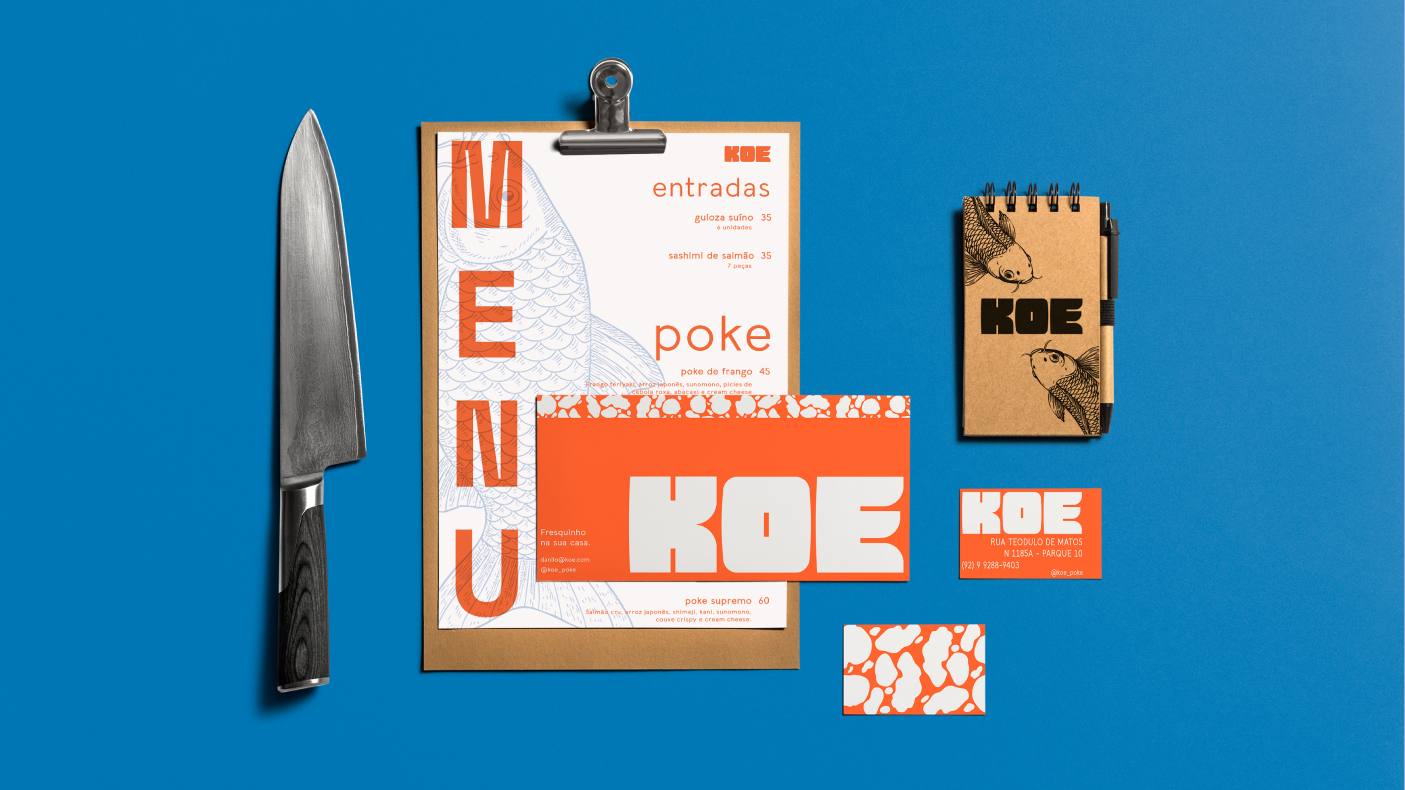
Identidade Visual
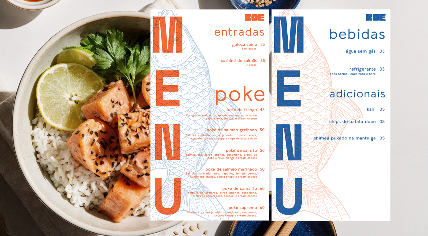
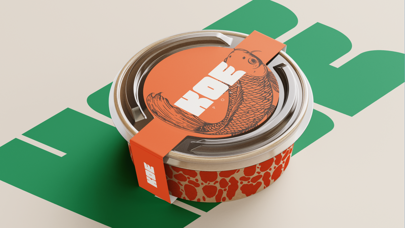
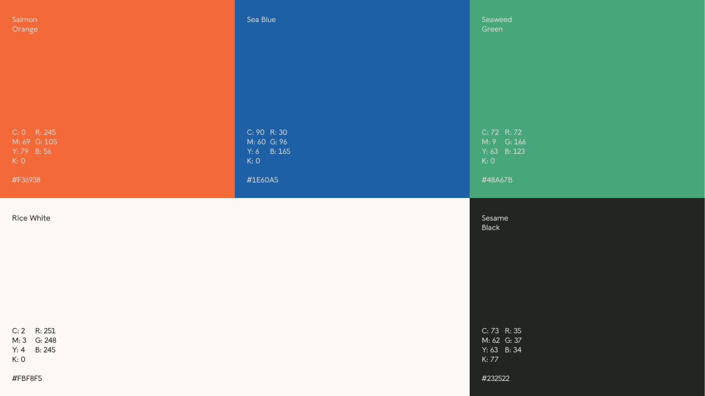
A Identidade Visual usa uma paleta de cores tropicais (laranja, azul, verde, preto e off-white) inspirada no poke e na sinalização japonesa, conectando a herança do dono com a marca.
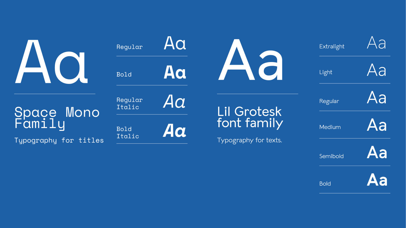
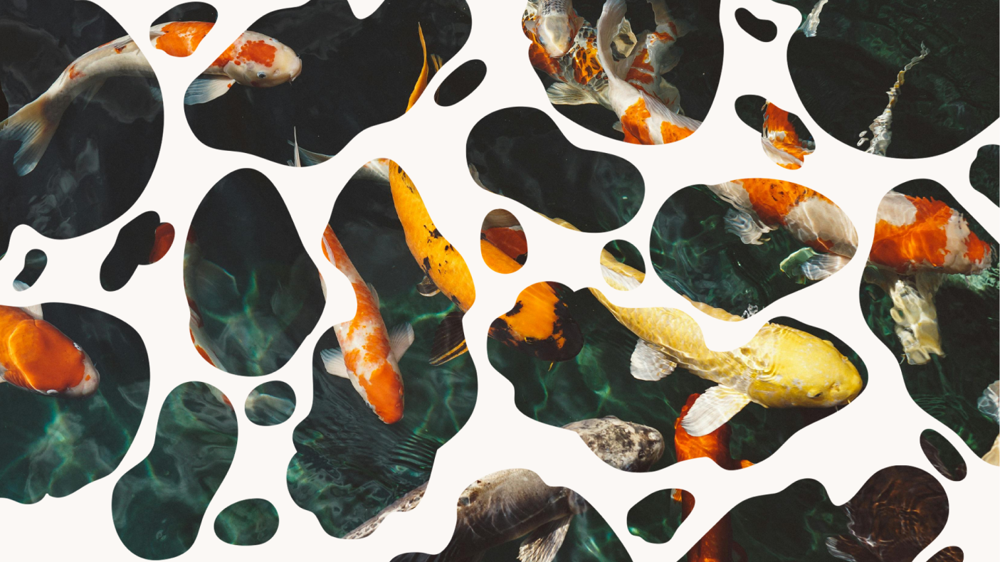
O sistema visual inclui um pattern exclusivo, desenhado à mão com base em manchas de carpas, ideal para embalagens e outros materiais. A tipografia combina Space Mono, com seu estilo retro-futurista para títulos, e Lil Grotesk, que traz leveza e fluidez para a leitura. Juntas, elas criam uma identidade moderna e acolhedora.
[EN]
Visual Identity
The Visual Identity features a tropical color palette (orange, blue, green, black, and off-white) inspired by poke ingredients and Japanese signage, linking the owner's heritage with the brand.
The visual system includes an exclusive hand-drawn pattern based on koi fish markings, perfect for packaging and other materials. The typography combines Space Mono, with its retro-futuristic style for titles, and Lil Grotesk, which provides a light and fluid reading experience. Together, they create a modern and inviting identity.